
Project: Dr. T Labs Brand Guide
Project type:
A comprehensive brand style guide for a bespoke guitar pedal business.
“The main goal was to design a style guide that would enable the client to remain consistent across any platform he might use for his business, including—but not limited to—web, print, and merchandise.”
Project overview:
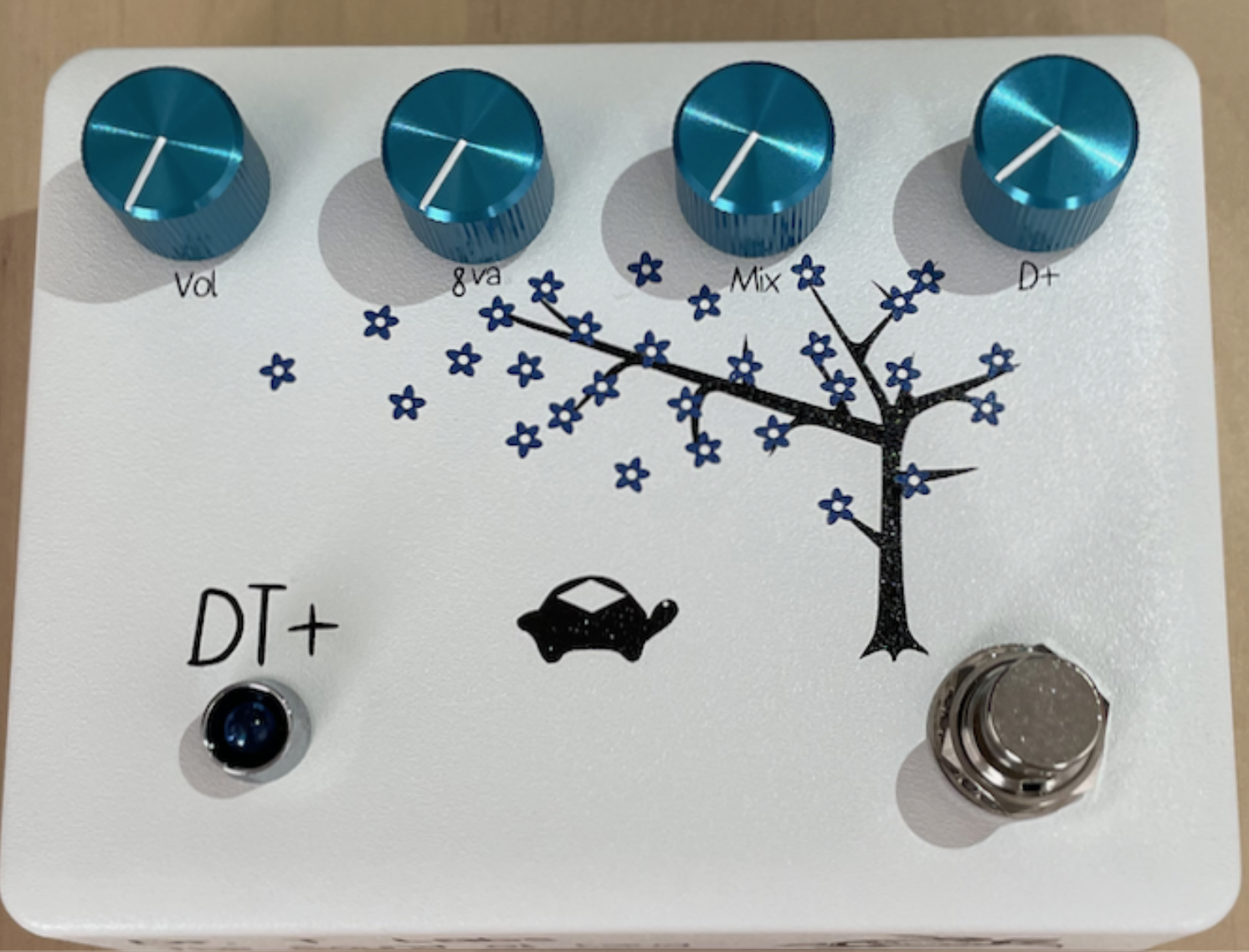
My client, Andrew Ritchey, is the sole proprietor of a small business named Dr. T Labs, where he builds guitar pedals that he designs and assembles himself. He has a web presence already with his business’ website and Reverb shop, as well as the Kickstarter that helped him fund the initial costs of producing his first pedal. However, he lacked a comprehensive style guide that would ensure his brand would be consistent across platforms, especially since he was looking to do a rebrand, which is where I came in.
Role:
My role was to create the style guide, combining aspects he already had for the business and creating additional sections that would more clearly define his brand. I communicated directly with the client.
Deliverables:
The deliverable I provided the client was a PDF of the brand guide. I created this using Adobe InDesign, as well as using Photoshop and Illustrator for individual images within the guide.
Goals:
The main goal was to design a style guide that would enable the client to remain consistent across any platform he might use for his business, including—but not limited to—web, print, and merchandise. This consistency would ensure respectability among current and future customers, as well as among music shops that sell his products.
Problem:
The biggest issue was making sure that I incorporated what he already had for the business and matched what I designed with it all.
Design Process
Logo:
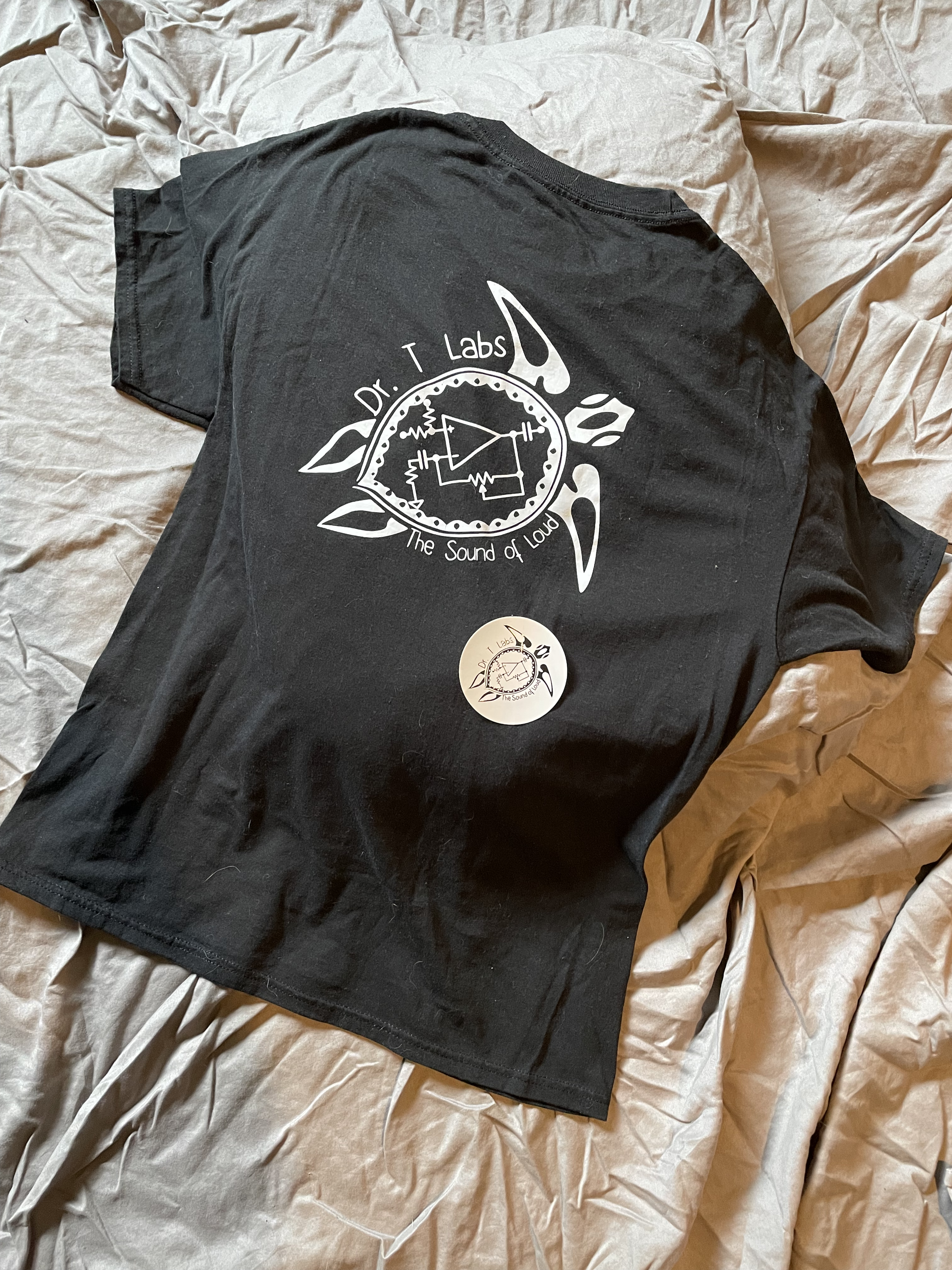
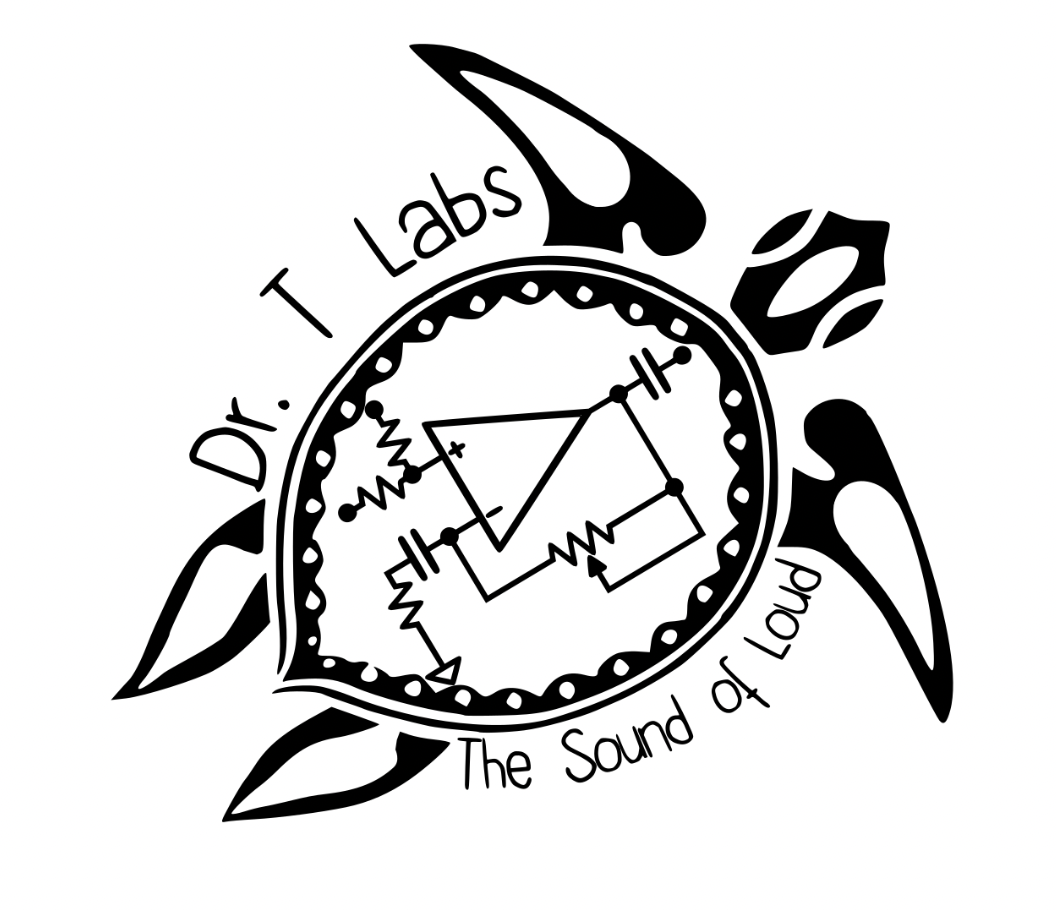
Andrew had created the logo himself. Since he was happy with it, and my designer assessment was that it was a clear and effective logo that captured the essence of the business, I left it as is.
I did, however, take inspiration from the logo for the brand colors, as explained below.
“The logo...was a clear and effective logo that captured the essence of the business”
Colors:
For the colors, I chose to continue using black for fonts and outlines, and white for backgrounds, although these may be inverted for the logo and text on merchandise.
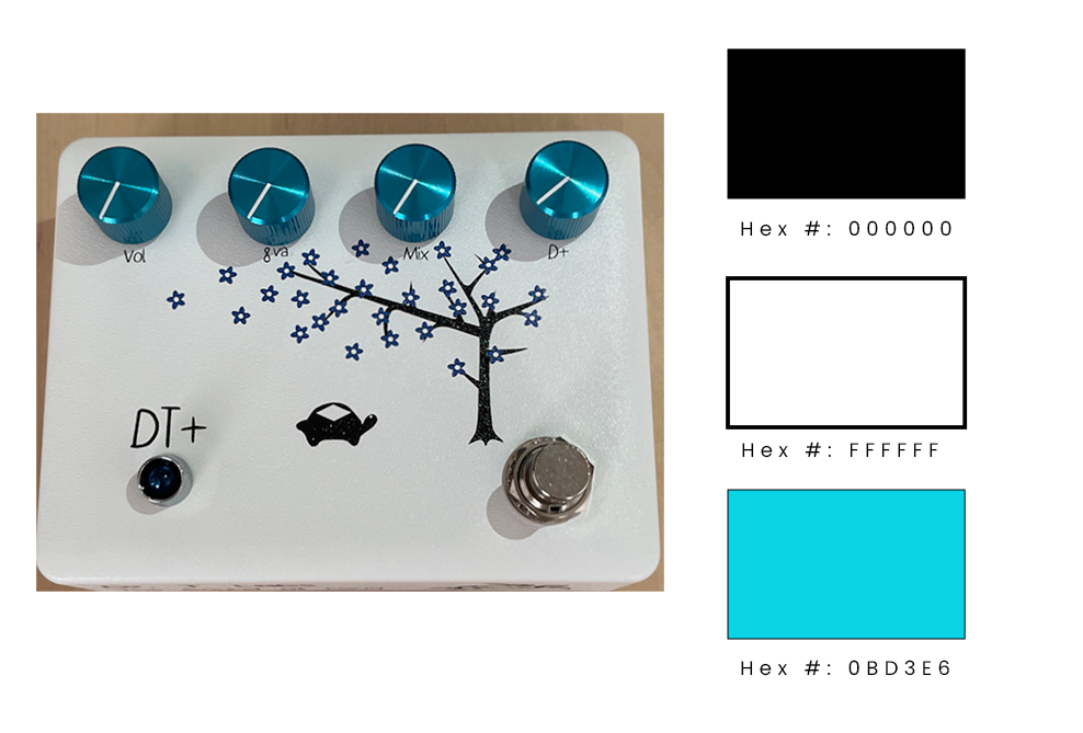
There was no accent color for the brand, however. Only using black and white seemed a little too bland. Therefore, I took inspiration for the blue I chose from the color of the knobs on the first pedal he designed, the Diamondback Terrapin (DT+). This would provide a bit of fun and whimsy per the brand’s identity, as well as emulate water that the turtle in the logo could appear to swim in.
“[The accent color] would provide a bit of fun and whimsy...as well as emulate water that the turtle in the logo could appear to swim in”
Typography:
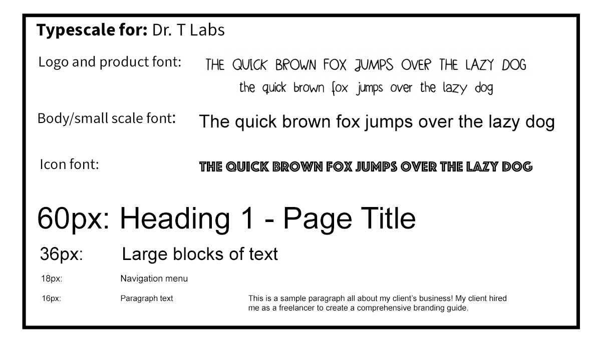
The logo font, which also appears on the DT+ pedal, is called Bobsmade Font. Since it complements the brand identity, I chose not to change it. Also, since it is not found in Google Fonts, it can be located and downloaded for free via wFonts.com.
For icon text, I used Phosphate Inline to mimic the etched designs often found in musical equipment, such as guitar picks and volume knobs.
For all other text for Dr. T Labs, Andrew used Arial Regular. I also chose not to change this, as it is a clear and easily readable font.
“The logo font...complements the brand identity”
Imagery:
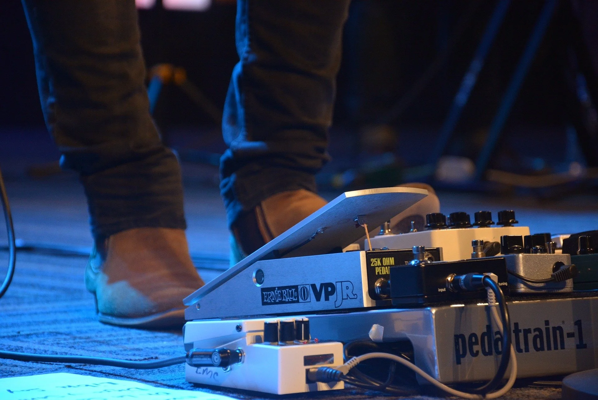
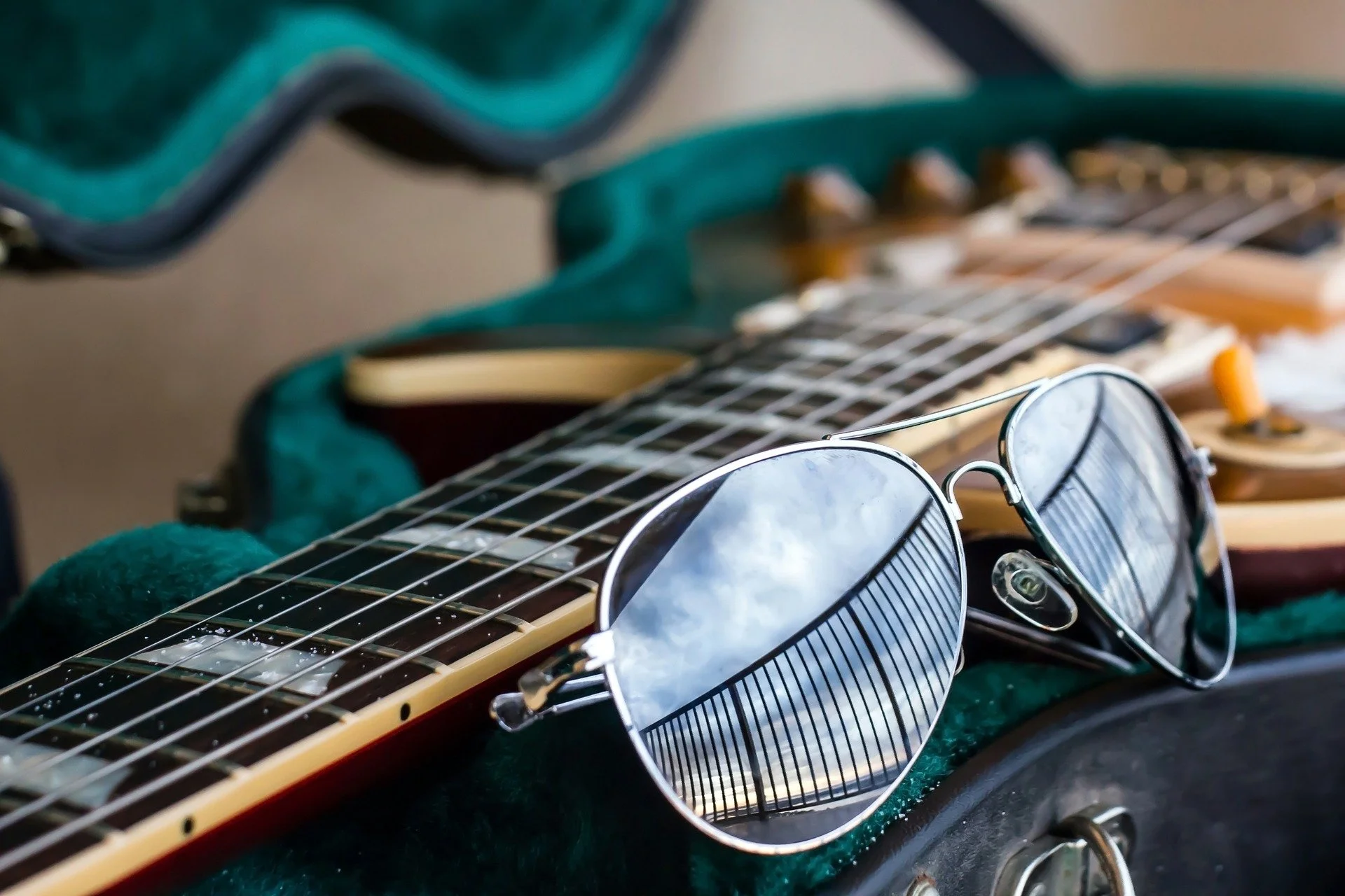
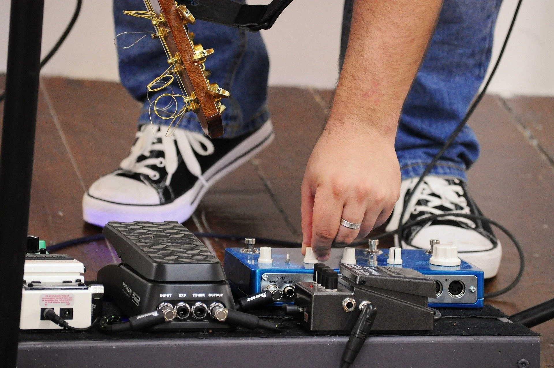
In addition to the logo, I felt it was necessary to have images that would align with the brand identity in places such as social media headers and print media. I found several images that would achieve this goal using guitars, pedals, and musicians via Pixabay.
Also, any product photos would be used to promote the business and what it offers.

“I felt it was necessary to have images that would align with the brand identity”
Iconography
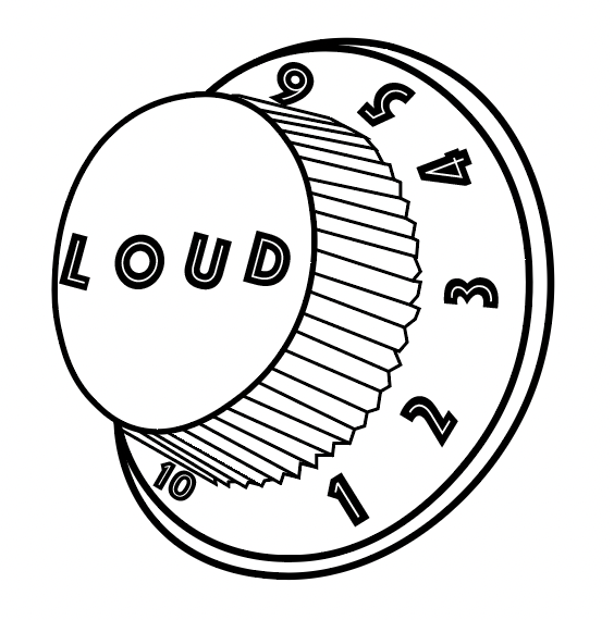
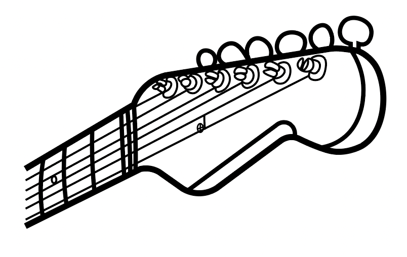
My inspiration for creating icons the client could use on his website, social media, print, and other platforms was taken from guitars and their equipment.
Using Illustrator, I created a volume knob, but replaced the word “volume” with “loud” to tie in better with the brand’s slogan, The Sound of Loud, using the Phosphate Inline font to mimic the etched lettering and numbering on actual knobs. I also created an icon of a guitar’s headstock. I kept these in black and white to align with the logo, and I left the lines a little less clean to match the brand’s identity, as well as the hand drawn feel of the decal on the DT+ pedal.
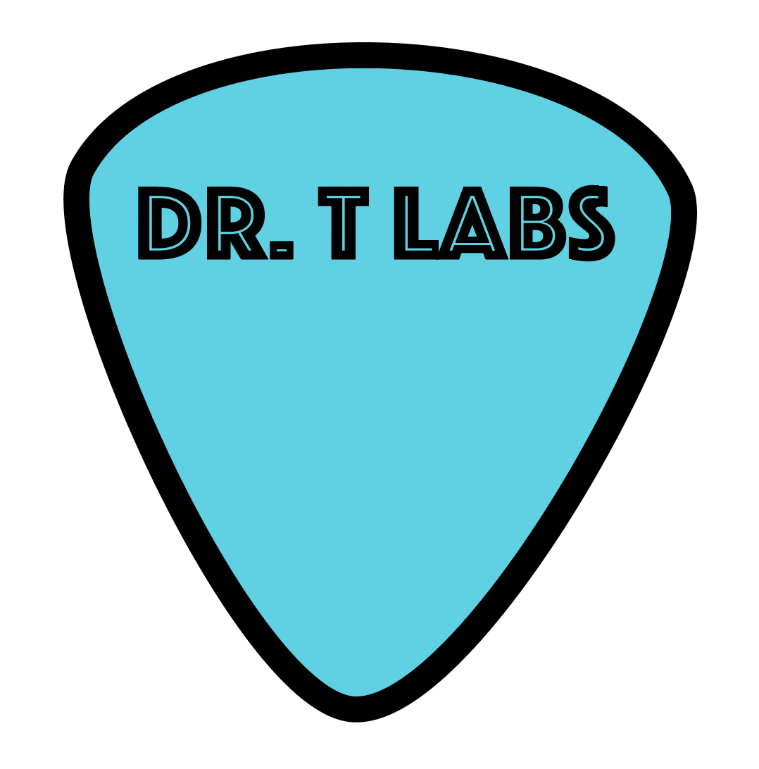
To give the client an option for a color icon, I created a guitar pick in the accent color. I once again chose to use the Phosphate Inline font to mimic the etched designs on actual picks, and kept it simple by using the name of the business only without additional imagery. This also gives him another opportunity for merchandise, as guitar picks in this style would be an easy way to market to fellow guitarists.
“My inspiration for creating icons the client could use on his website, social media, print, and other platforms was taken from guitars and their equipment”
Final Design
Click the image below to view the full guide
Challenges:
The biggest challenge was identifying the elements that made the brand what it is in order to achieve a consistent message. The client did want to keep as much as he already had, which I respected. Therefore, I had to come up with creative solutions to be sure the brand identity was the same when I created the rest of the guide.
In reviewing the existing materials, I determined that the brand identity was fun, cool, whimsical, contemporary, and exciting, and I endeavored to include those in the work I did on the guide. He agreed on the identity descriptors and allowed me the freedom to create additional materials that would best complement the existing ones.
“My brand style guide achieves the main goal of creating a consistent message and look for the client”
Conclusion:
My brand style guide achieves the main goal of creating a consistent message and look for the client. It uses existing materials, per the client’s request, while also using additional materials I created to assist in the brand’s consistency.
The client is now better able to bring an extra air of professionalism and respectability to the brand, regardless of platform.
What the client says about the finished product:
“Krystie was extremely easy to work with and walked me through every step of creating a comprehensive brand guide. Her clear communication helped get the job done quickly. I’m now looking forward to my brand relaunch with the updated guide Krystie created.”