
Project: Sit Conmigo Design Comps
Project type:
A set of website design comps for Sit Conmigo, a sustainable furniture company, that will scale for a variety of screens.
“My client...needed to have a website that would work on a variety of devices.”
Role:
My role was to communicate directly with the client and create a design comp that would meet her needs and wants for her website.
Project overview:
My client, Yolanda Lopez, is the CEO and founder of the Sit Conmigo company. Sit Conmigo specializes in chairs that are produced sustainably and ethically. Yolanda has designed four chairs so far, and felt it was the right time to launch her website. She has a web developer who will code the website, but first she needed someone to design it, which is where I came in. She needed to have a website that would work on a variety of devices, as well.
Deliverables:
Mobile, tablet, and desktop design comps, color and type styles that are inspired by the Site Conmigo logo and mission, and exported assets that will be used by a web developer.
Problem:
The main problem I was trying to solve with my design was making sure everything would be communicated effectively for mobile, tablet, and web screens, while not leaving out the essentials Yolanda requested.
Goals:
The main goals of Yolanda’s site were to showcase her chairs and entice customers to pre-order them; highlight her mission as a fair trade and fair labor designer; and visually communicate the personality and mission of her business.
Design Process
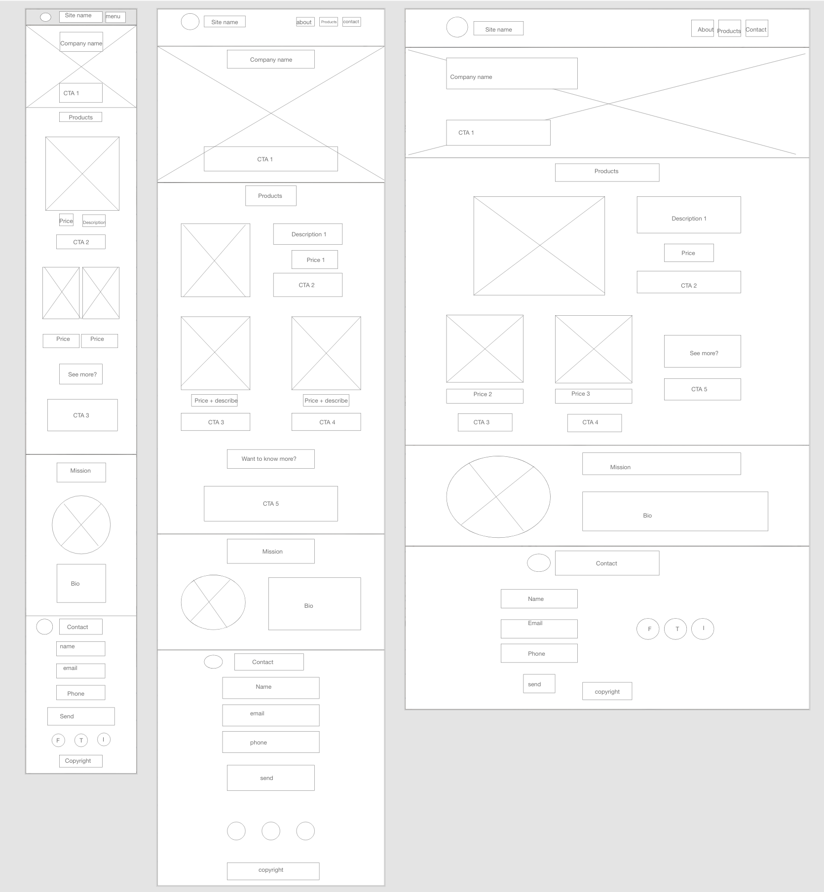
Wireframes
After considering Yolanda’s goals, I began creating wireframes for the Sit Conmigo website. I drafted a wireframe for mobile screens first, followed by tablet screens, and finally for a full website. By starting with a mobile design, it helped me identify the most essential information to include, which would then be extended and added to with designs for larger screens. It also helped me ensure I included her additional requests into my designs, which were:
a large header (CTA) with images and text encouraging customers to pre-order;
a Pre-order section that includes chair photos, product names, and links to pre-order the new chairs;
an About section with information about the company and its mission, which also includes a photo;
a Contact section in the footer with links to social media, an email address, and phone number;
and Navigation with links to the Pre-order, About, and Contact sections.
Based on feedback received after submitting the wireframes, I modified the design by removing the logo from the Contact section, the prices and “See more?” boxes from the Product sections, and adding a fourth product photo in order to showcase more of what Sit Conmigo has to offer.
“By starting with a mobile design, it helped me identify the most essential information to include.”
Colors
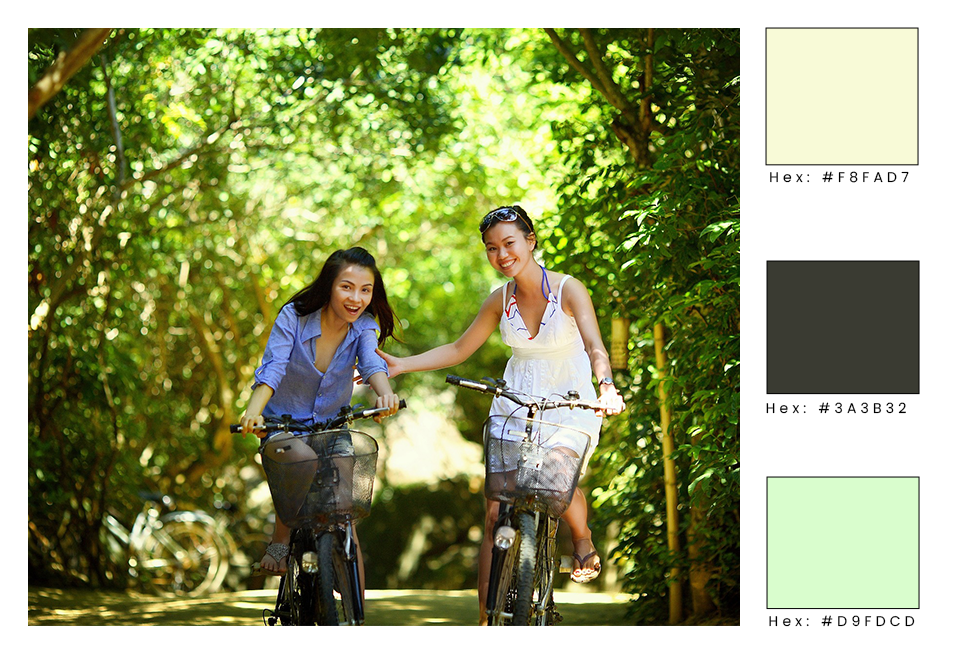
Yolanda indicated she’d like something that creates excitement but doesn’t distract from her chairs’ photos. She also preferred to have the human-element and environmental-element represented visually on the site to convey Sit Conmigo’s mission. She wanted the colors to make the company appear serious and trustworthy because she feels their mission is important for the health of people and the planet.
I chose a green-centered scheme to achieve these goals, with a subtle yellow-green as the main background, a dark forest green for text, and a light spring green as a highlight. As green communicates environment, health, growth, and calm, it seemed the right choice to visually communicate Yolanda’s ideas.
“...green communicates environment, health, growth, and calm...”

Typography
I kept Yolanda’s visual requests for something that would appear trustworthy and incorporate the human-element into her website.
I chose the display font Pacifico for the larger headings in order to add a human-element feel, while the sans-serif Alato worked well in navigation and paragraphs for seriousness and trustworthiness, as well as being easy to read across screen sizes.
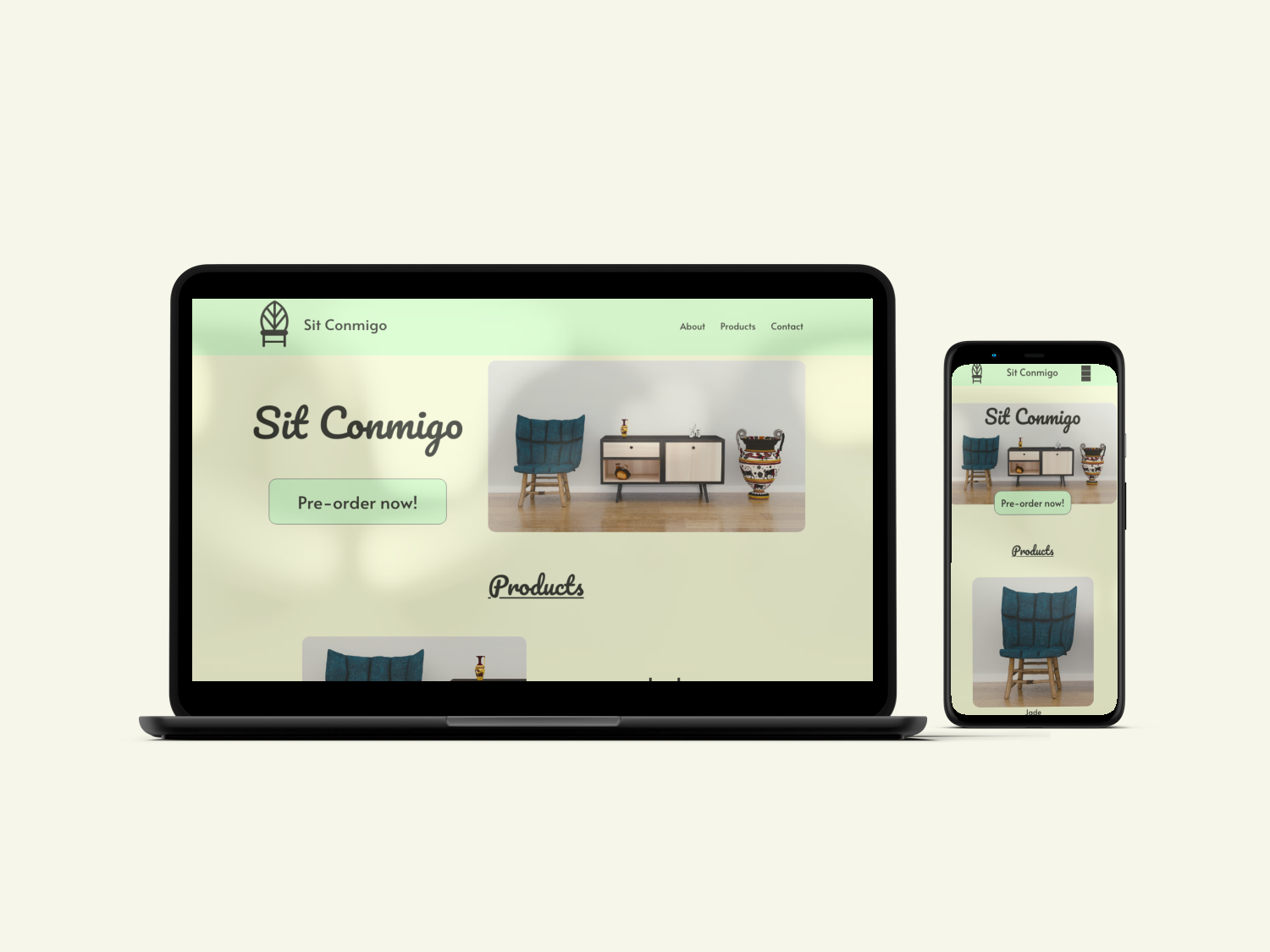
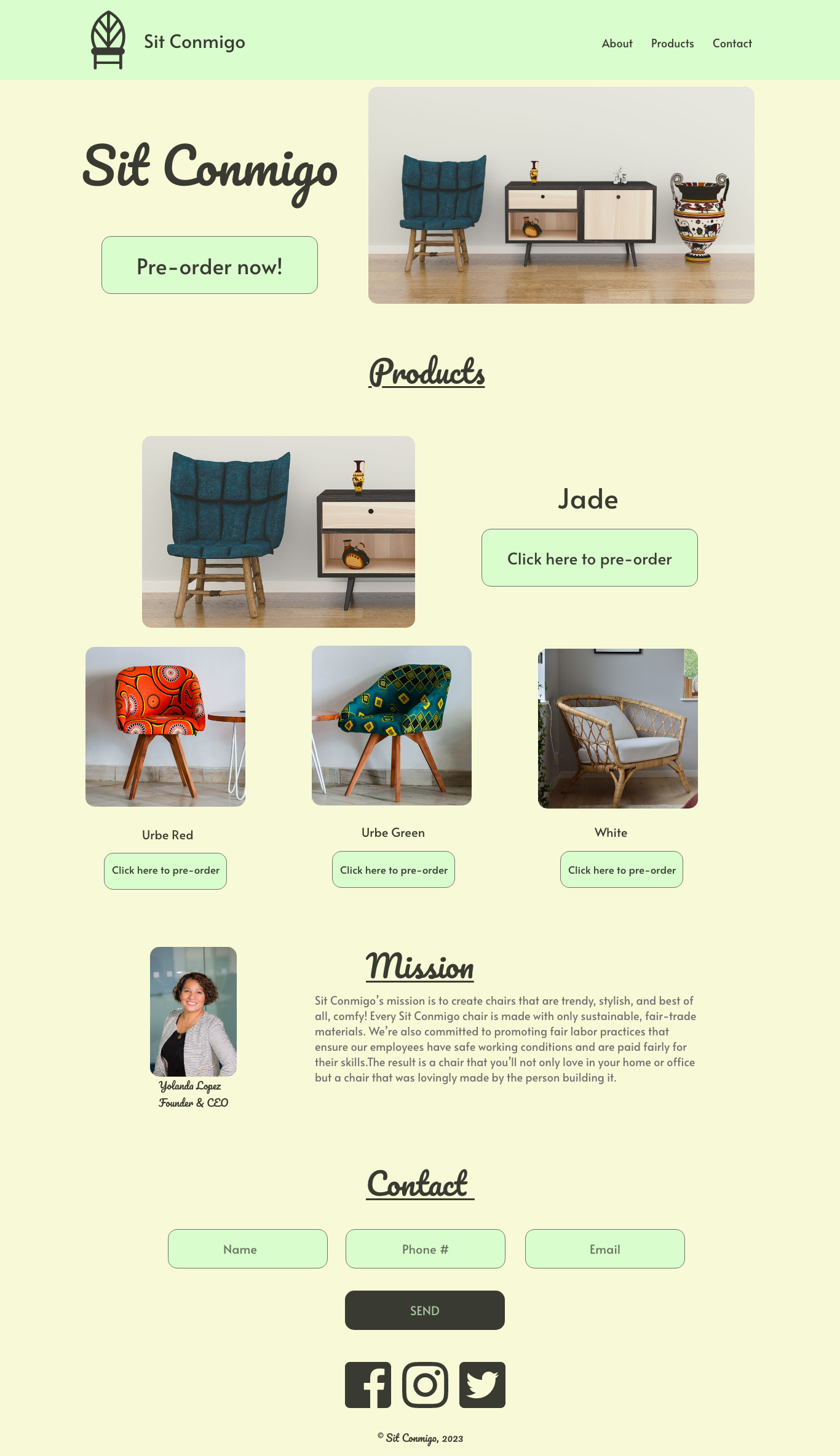
Final Designs
Mobile

Tablet

“I kept Yolanda’s visual requests for something that would appear trustworthy and incorporate the human-element into her website.”
Web/Desktop
“...updating my ideas [as I work] is a necessary part of the design process.”
Challenges:
One challenge was in incorporating all of Yolanda’s requests in a way that would transfer across different screen sizes. After receiving feedback from a Skillcrush instructor on my wireframes, I made changes that better allowed for said transfer of information, which can be viewed when comparing the wireframes with the final deliverables.
Also, it was a challenge to choose a color scheme that included what Yolanda was looking for in communicating her brand, as she wanted something that was both serious and tied to the environment. At first, I considered using a scheme centered around browns, but I went with greens because that seemed a better fit for the environmental aspect. A mix of subtle, dark, and light greens achieved this ideal.
The main takeaway from these challenges for me is that it is okay to go in a different direction with my design ideas as I work, and that updating my ideas is a necessary part of the design process.
“I was able to help [my client] communicate the Sit Conmigo brand effectively”
Conclusion:
The conclusion of the project is that I had a design comp that showcased how Yolanda’s website would look across three different screen sizes. By beginning with a mobile screen design first, I was able to help her communicate the Sit Conmigo brand effectively and the exported assets will help her web developer bring these ideas to life.