
Project: The Whole Bean Brand Guide
Type of project:
Create a complete brand guide for a mock coffee shop called The Whole Bean.
“I wanted to reflect the brand’s personality: sincere, calm, wholesome, and inviting.”
Role:
My role was to understand the branding and identity goals of The Whole Bean and translate them into a complete style guide. I was responsible for communicating directly with the client.
Deliverables:
Examples of icons, social media headers, a logo and its approved variations, color schemes, typography, and a mission statement, all contained within a digital guide created in Adobe InDesign, Illustrator, and Photoshop.
Project overview:
My client, Karla Kahvi, was about to open her new coffee shop, The Whole Bean. However, she lacked branding and an identity for the shop, which is where I came in. I created a style guide for her, which included the shop’s logo, mission statement, and guidelines for her website and social media (typescale, imagery, icons, and colors.)
Goals:
Karla wanted a brand and identity that fit her products and resonated with the neighborhood the shop was in. Since she was more comfortable with the business and financial side of the shop, she left it up to me to create the branding for her.
Problem:
After evaluating the location and products of The Whole Bean, I needed to interpret her vision and make sure the branding fit the shop accordingly, starting from scratch. The design of the style guide was intended to solve the problem of how to do just that.
Design process
Colors
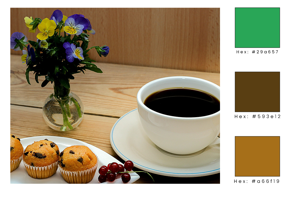
I wanted to reflect the brand’s personality: sincere, calm, wholesome, and inviting. Using color theory as my guide, I decided to make the main color green to reflect a sense of peace that customers will feel when they are visiting the shop, as well as the healthiness of the products Karla is offering. I decided to use two shades of brown-–a dark one and a light one-–as additional colors to reflect earthiness, as well as the color of coffee and tea.
“I wanted to reflect a sense of wholesomeness and of being inviting to members of the community.”
Typography
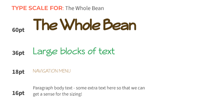
I wanted to reflect a sense of wholesomeness and of being inviting to members of the community. After viewing many different fonts, I settled on Veggieburger to communicate these ideals as the main font. I chose Josefin Sans as an easy-to-read font for larger amounts of text, such as product descriptions on the website.
“It was important to...emphasize a feeling of connectedness to others and the earth.”
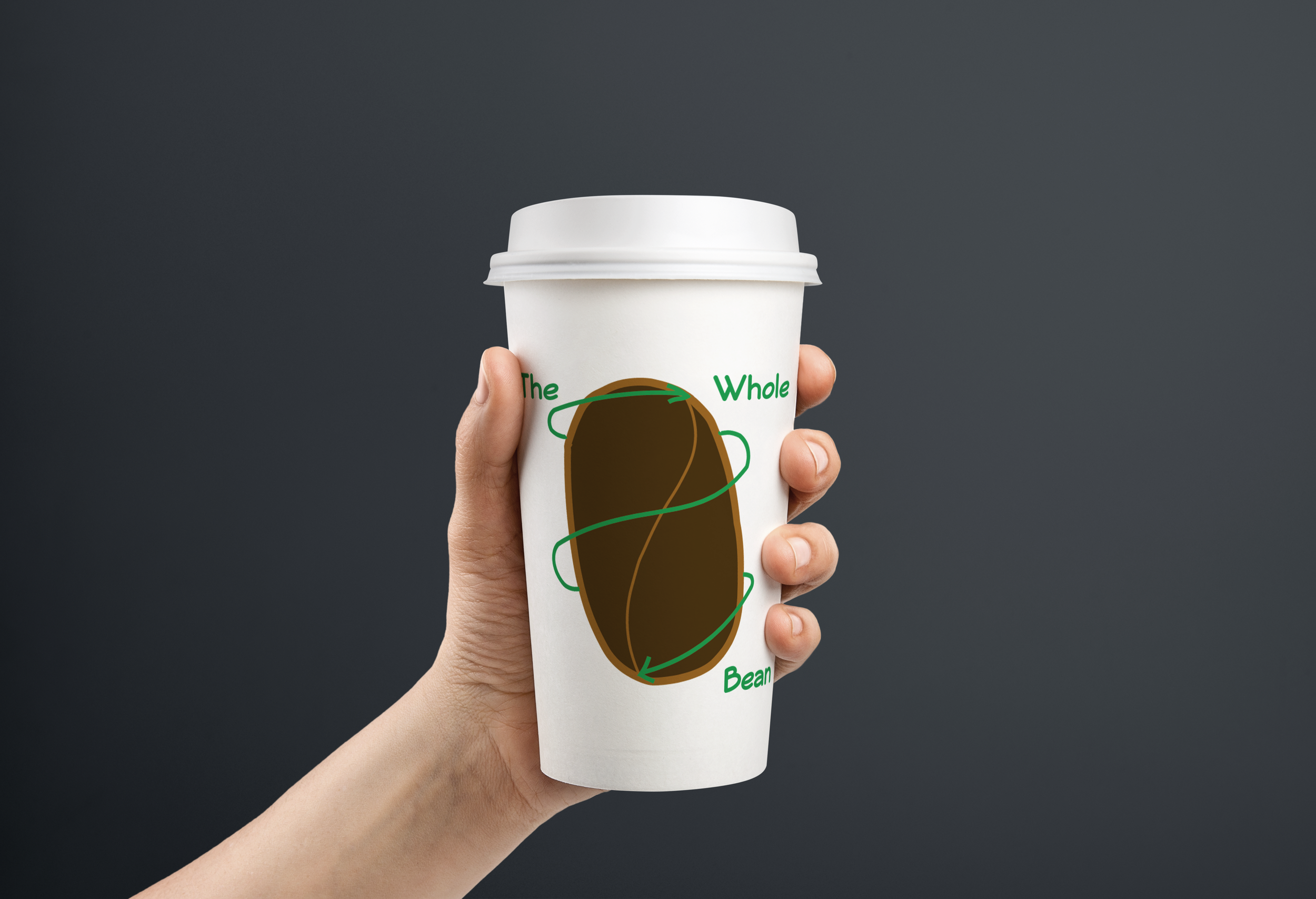
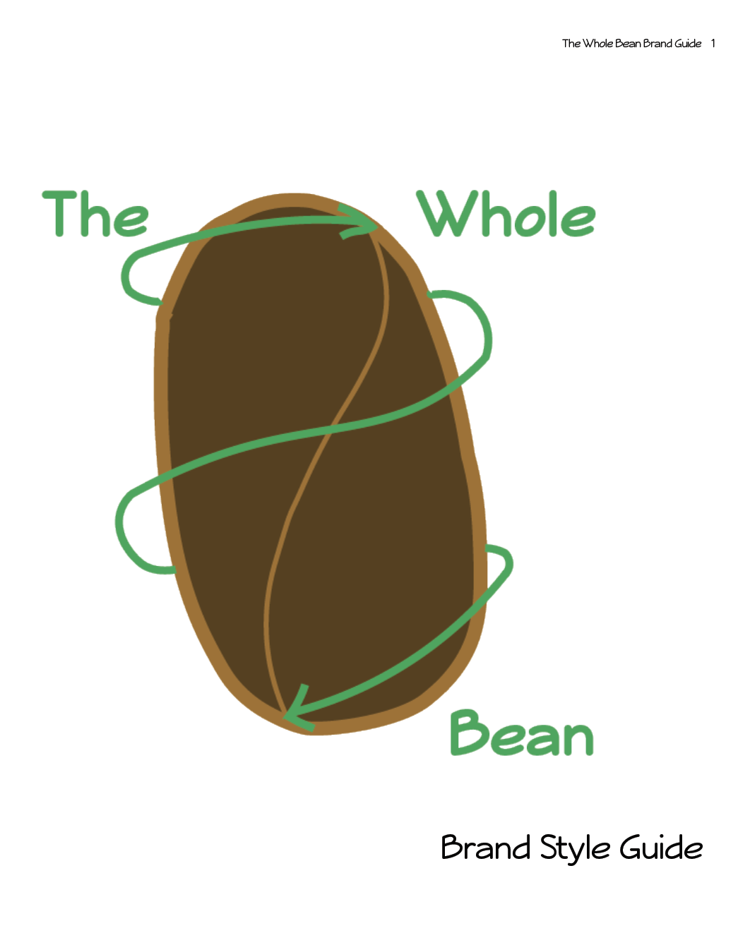
Logo
In designing the logo, it was important to not only make it clear what kind of business it was, but to also emphasize a feeling of connectedness to others and the earth. Using the image of a coffee bean communicates to passersby what they can expect in the shop. I chose to wrap the coffee bean in an arrow to evoke a sense of connection, as well as emphasize the “Whole” part of the shop name.
“I wanted to highlight products offered by the shop with each icon to entice customers to try them.”
Iconography
I kept the icons simple, yet clear. I left the lines a little less clean in order to show wholesomeness and simplicity; this also provides a sense of movement to the designs. I wanted to highlight products offered by the shop with each icon to entice customers to try them, and I chose the secondary color (dark brown) to further evoke a down-to-earth feeling and connection to the types of products offered (e.g., coffee products and pastries.)
“In selecting imagery for the shop, it was important to keep the brand identity in mind.”


Imagery
In selecting imagery for the shop, it was important to keep the brand identity in mind. I used Pixabay to search for images using the keywords “wholesome”, “down-to-earth”, “inviting”, “friendly”, and “calm”, as well as images that use the kinds of products offered in The Whole Bean. These are a small selection of images that I felt will work well for this intention.


Final Design
Click the image to view full guide
Challenges:
While having carte blanche to create a shop identity from the ground up was great from a creative standpoint, the actual process of choosing all the necessary aspects to best reflect The Whole Bean was a challenge and, at times, overwhelming. To make the project more manageable, I broke it down into smaller steps and worked on it piece by piece until it was completed (e.g., draw the logo on paper first, then upload it to Adobe Illustrator to create the image.) I also made sure to keep the mission statement and brand personality in mind with every decision I made; this helped me stay on the right track in creating a comprehensive brand and identity for the shop.
As I continued working on the project, I found the creative challenge of building a brand from the ground up fulfilling and interesting, and I really enjoyed the process. Also, this project necessitated learning new skills, such as Adobe Illustrator; creating the logo in Illustrator, in particular, was difficult for me at first. While I have room to grow in my Illustrator skills, I feel more confident in adding it to my creative toolbelt; this confidence is shown in the icons I created for the shop’s website.
“I found the creative challenge of building a brand from the ground up fulfilling and interesting, and I really enjoyed the process.”
Conclusion:
The result of the project was a complete branding and style guide for The Whole Bean, deliverable in a PDF to the client. She was happy with the style choices I had made, as well as grateful for interpreting her vision for the shop effectively. The design choices define the shop and will help her with advertising, and they also are effective in creating the connection that will make the shop successful.